See All Photos
Luxe, Spring '14,
"Hamptons Revival", Written by Cara Greenberg, Photography by Peter Murdock, pages 272-287
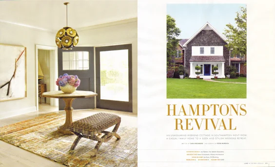
An unassuming weekend cottage in Southampton went from a casual family home to a sleek and stylish weekend retreat.
It began simply enough. Designer Joe Nahem’s clients, a couple whose Manhattan duplex he had recently finished updating, decided they wanted their weekend home in Southampton “freshened up.” But it soon became clear that the traditional-style cedar-shingled house, which the couple bought in the early 1990s when their three sons were small, was ill-suited to their current lives as empty nesters. “The master bedroom was too tight; the family room was undersized; and they each wanted home offices,” recalls Nahem, and that was just for starters. Ultimately, the “refresh” became a rebuild, which the designer affectionately credits to the “while-we’re-at-it” phenomenon. “We ended up doing everything, and then some.”
Between Labor Day 2012 and the following Memorial Day, about half of the original 5,500 square feet was torn down and rebuilt or reconfigured, culminating in an 8,000-square-foot home. The sweeping renovation, a collaboration between Fox-Nahem Associates, Nahem’s renowned design firm, and New York-based Alveary Architecture, affected every single room.
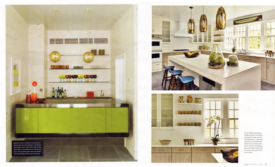
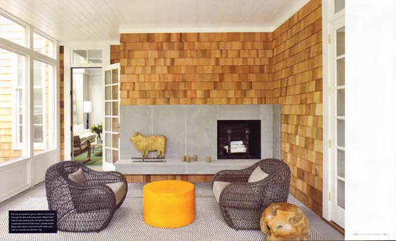
As before, the house has a pair of wings on either side of a peaked center section. One of those wings was demolished and rebuilt in its entirety and now contains a cozy den that leads to a wide screened porch in back, with expanded bedrooms above. The wing on the other side of the house was bumped out to accommodate a wholly remodeled kitchen, with an enlarged family room behind, adjacent to a deck and 55-foot pool. All seven bathrooms were redone, and the construction team even dug down deeper into the foundation to create a new lower level, with a playroom, laundry room, staff rooms, and wine cellar.
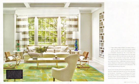
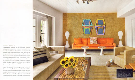
The showstopping living room, with its 12-foot coffered ceiling and spectacular wall of windows, was perhaps the most radical interior change. It required eliminating the existing two-story living room and mezzanine in the central core of the house. “When we first saw the living room, it looked like a suburban spec house,” recalls Nahem. “The proportions were off. We told the clients, “We know you’re going to say no, but we want to drop the ceiling.” As he suspected, it wasn’t an easy sell, though the clients admitted no one ever seemed to want to spend time in that soaring space. In the end, they loved the change. Besides making the living room more intimate and inviting, they gained space upstairs for a dramatically lofty master suite.
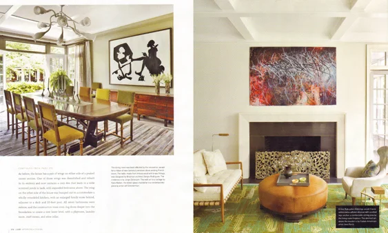
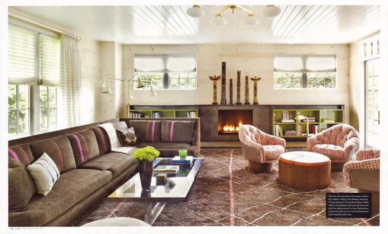
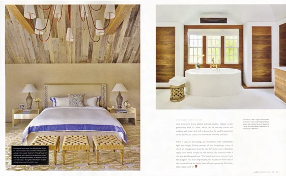
Nahem didn’t just make the house bigger, though; he made it a lot more interesting. There’s a wide variety of materials, including reclaimed oak on the floors throughout and a reclaimed barn-wood ceiling in the master bedroom, all locally sourced from old farm buildings slated for demolition. The family room has unusual cork walls and furnishings, while the walls in the den are whitewashed oak, with prominent knots adding textural interest. Nahem is also particularly fond of Corian, which can be precisely carved and sculpted and lends itself well to lacquering. He used it extensively in the kitchen, in addition to the master bedroom and bath.
When it comes to decorating, the watchwords were comfortable, light and bright. Ninety percent of the furnishings, many of which are vintage pieces from the mid-20th century and of European origin, were newly bought for the project. The interiors strike a chic and mostly casual note. “It’s fresher and more current,” says the designer, “but more importantly, the house now works well in the context of how the family lives. When we got to the finish line, they totally loved it!”

