Luxe Mar/Apr ’16,
"Second Time Around", Written by Lisa Davis. Photography by Peter Murdock,
pages 294-307
DESIGNER JOE NAHEM REVISITS AND REINVENTS THE INTERIOR OF A NEW YORK CITY DUPLEX.
It wasn't that the first time around wasn't good enough. Thirteen years ago, designer Joe Nahem created a haven for a then-childless couple on the 11th and 12th floors of a 140-unit family-owned apartment building in Chelsea, but over time, the couple added a girl and twin boys to their family. To transform the apartment into a larger, more baby-friendly space, the couple annexed an 800-square-foot apartment, creating a more spacious 5,500-square-foot five-bedroom home, and as the children approached the tween phase, "they wanted to update, upgrade and refresh," says Nahem.
The owners decided to undergo what one of them calls a "cosmetic renovation." The catch: it had to be done while the family was away for the summer. Nahem and his team, who had also designed the couple's Hamptons house, their corporate offices and their mother's and sister's homes, had 10 weeks to reinvent the apartment. "When they came home after Labor Day, it had to be 100 percent finished," says Nahem. Well aware of the tight time constraint—they had taken six months—general contractor James Mansfield oversaw the operation. "To make it work we broke it down into multiple pieces and broke those pieces down with multiple subcontractors," says Mansfield, who hired four cabinet makers, two flooring companies, two tile companies and two plaster companies. The latter were responsible for almost $250,000 worth of Venetian plaster. "There were about 12 varieties, colors, finishes and glazes of plaster, and we had to match the existing exactly while replacing all of it," says Mansfields. A little healthy competition pushed the project ahead. The eight to 12 plasterers working there daily "turned it into a beauty contest," he adds. "They each wanted to prove what an incredible product they could produce."
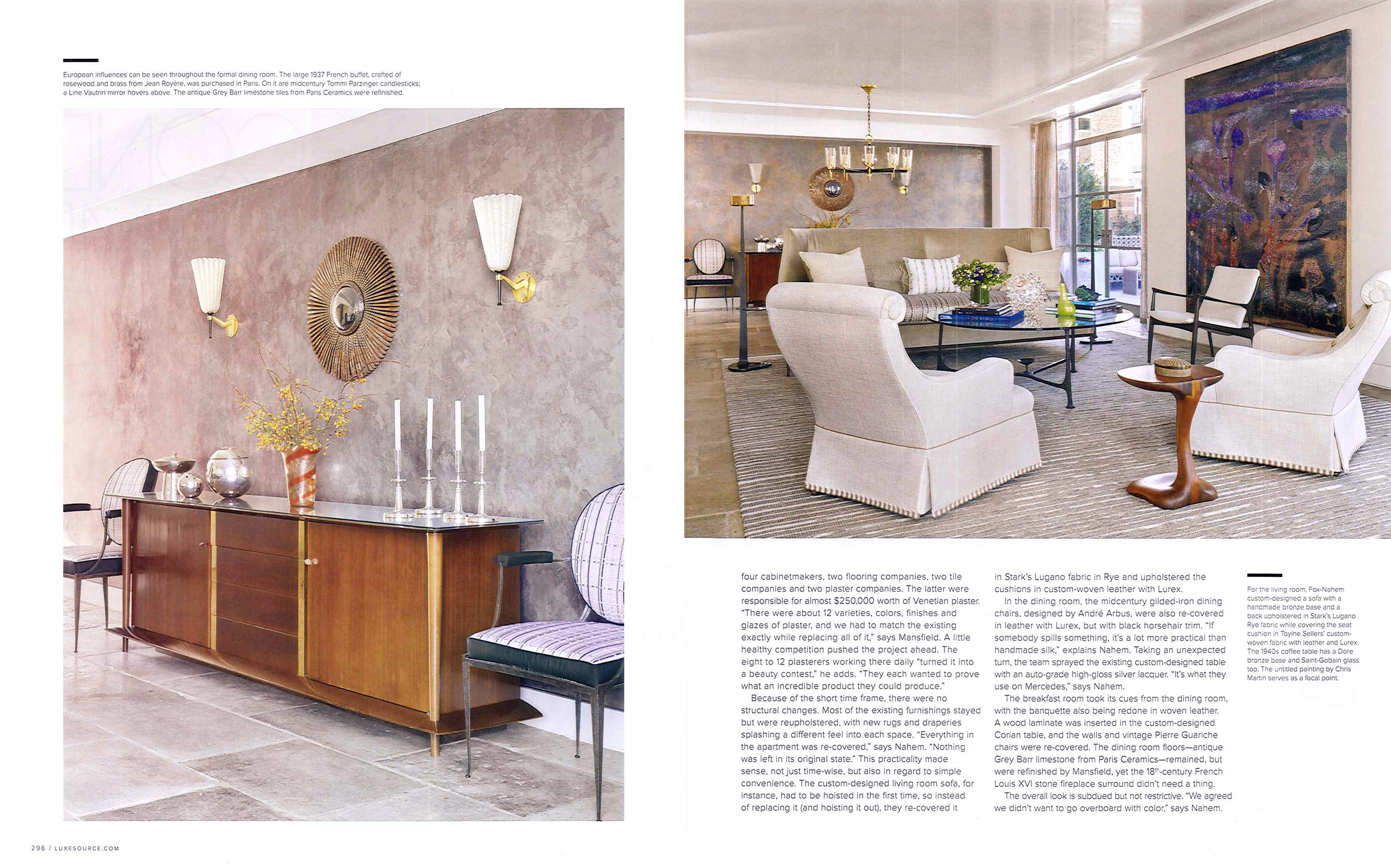
Because of the short time frame, there were no structural changes. Most of the existing furnishings stayed but were reupholstered, with new rugs and draperies splashing a different feel into each space. "Everything in the apartment was re-covered," says Nahem. "Nothing was left in its original state." This practicality made sense, not just time-wise, but in regard to simple convenience. The custom-designed living room sofa, for instance, had to be hoisted in the first time, so instead of replacing it (and hoisting it out), they re-covered it in Stark's Lugano fabric in Rye and upholstered the cushions in custom-woven leather with Lurex.
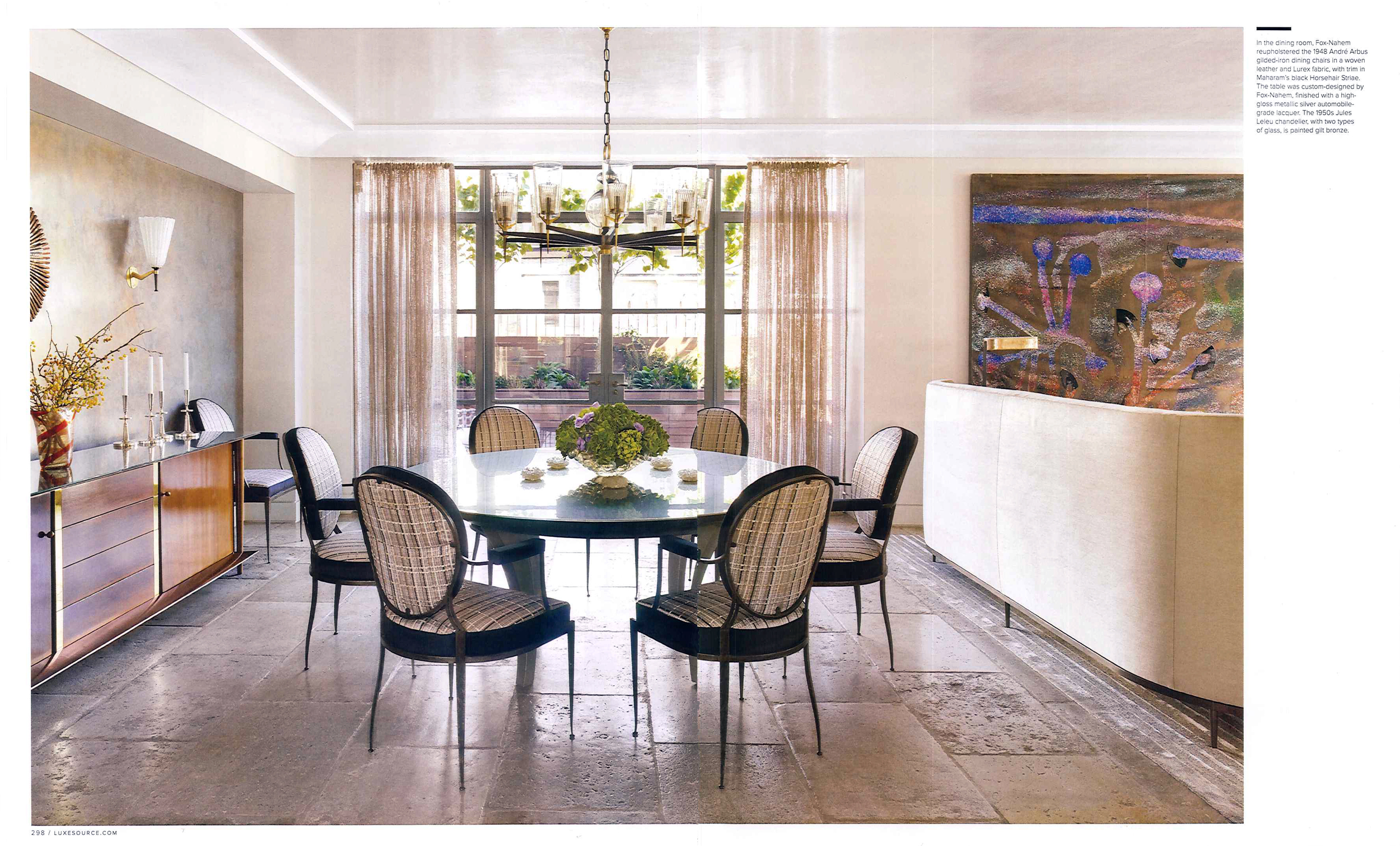
In the dining room, the midcentury gilded-iron dining chairs, designed by Andre Arbus, were also re-covered in leather with Lurex, but with black horsehair trim. "If somebody spills something, it's a lot more practical than handmade silk," explains Nahem. Taking an unexpected turn, the team sprayed the existing custom-designed table with and auto-grade high-gloss silver laquer. "It's what they use on Mercedes," says Nahem.
The breakfast room took its cues from the dining room, with the banquette also being redone in woven leather. A wood laminate was inserted in the custom-designed Corian table, and the walls and vintage Pierrre Guariche chairs were re-covered. The dining room floors — antique Grey Barr limestone from Paris Ceramics — remained, but were refinished by Mansfield, yet the 18th-century French Louis XVI stone fireplace surround didn't need a thing.
The overall look is subdued but not restrictive. "We agreed we didn't want to go overboard with color," says Nahem.
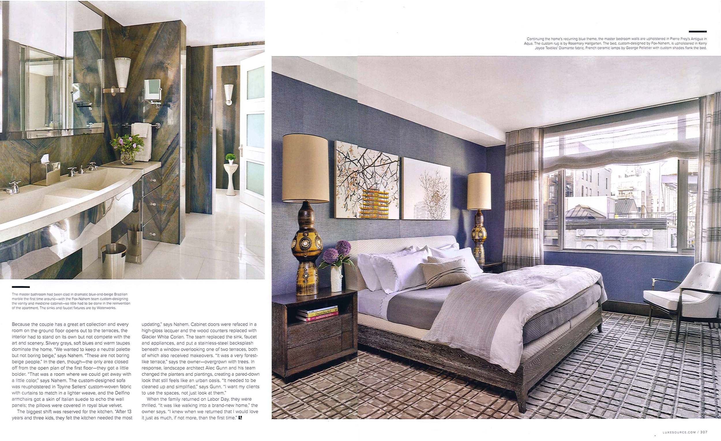
Because the couple has a great are collection and every room on the ground floor opens out to the terraces, the interior had to stand on its own but not compete with the art and scenery. Silvery grays, soft blues and warm taupes dominate the home. "We wanted to keep a neutral palette but not boring beige," says Nahem. "These are not boring beige people." In the den, though - the only area closed off from the open plan of the first floor - they got a little bolder. "That was a room where we could get away with a little color," says Nahem. The custom-designed sofa was reupholstered in Toyine Seller's custome-woven fabric with curtains to match in a lighter weave, and the Delfino armchairs got a skin of Italian suede to echo the wall panels; the pillows were covered in royal blue velvet.
The biggest shift was reserved for the kitchen. After 13 years and three kids, they felt the kitchen needed the most updating," says Nahem. Cabinet doors were refaced in a high-gloss lacquer and the wood counters replaced with Glacier White Corian. The team replaced the sink, faucet and appliances, and put a stainless steel backsplash beneath a window overlooking one of two terraces, both of which also received makeovers. "It was a very forest-like terrace," says the owner - overgrown with trees. In response, landscape architect Alec Gunn and his team changed the planters and plantings, creating a pared-down look that still feels like an urban oasis. "It needed to be cleaned up and simplified," says Gunn. "I want my clients to use the spaces, not just look at them.
When the family returned on Labor Day, they were thrilled. "It was like walking into a brand-new home," the owner says. "I knew when we returned that I would love it just as much, if not more, than the first time."


