See All Photos
Elle Décor Nov '08, "Good, Better, Best"
pages 206-213 by Ingrid Abramovitch
WITH LUXURIOUS TEXTURES, GUTSY DETAILS, AND AN EYE FOR QUALITY, INTERIOR DESIGNER JOE NAHEM TURNS A YOUNG FAMILY'S HAMPTONS SPEC HOUSE INTO SOMETHING TRULY SPECIAL.
"When people ask me for my opinion, I don't want to insult them," confides Joe Nahem, an interior designer who possesses all the candor expected of a native New Yorker. "But I have to be honest." So when longtime clients Luigi Caiola and Sean McGill invited him to see their new weekend house in the Long Island hamlet of Amagansett, they were not surprised to hear Nahem declare that almost everything in the developer's special had to go, from the oak paneling in the den to the stone-veneer fireplace in the living room. "I called it de-specing, "Nahem says of the proposed makeover. "It needed major refinement."
Caiola and McGill thought the renovation plan sounded daunting. But they loved the house's location on a quaint lane a block from the beach. And they trusted Nahem. With his late partner, Tom Fox, the designer had worked on the couple's previous home in the Hamptons as well as their Manhattan apartment and offices for Caiola's family real-estate firm. "He knows exactly what we like and don't like," says McGill, a recruiting coordinator at Columbia University.
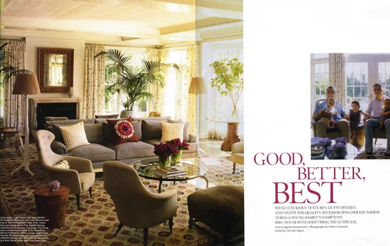
A big problem Nahem highlighted was the awkward floor plan. It made the house seem small, even at 4,000 square feet, so he brought in Steve Chrostowski of Alveary Architecture to improve the flow. The most dramatic transformation came with a living room addition of several hundred square feet; the architect also removed the wall that separated the original narrow space from the sunroom, creating a large living area that is perfectly square. Sunlight now streams through a bay window, and the linen-covered furniture including unusual 1953 Paradiset lounge chairs by Swedish designer Kerstin Horlin-Holmqvist and potted palms give the altered interior the languid charm of a mod plantation.
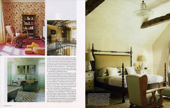
The first-floor expansion gave Nahem a platform to create an en suite master bath upstairs. Seductive tiles sea-green on the walls and vivid 19th century Italian on the floor convey a hammamlike ambience. The striking room also has a shower with a garden-view window, a silvery tub, and evidence of Nahem's penchant for unexpected textures: The tray ceiling of whitewashed planks has the soft, weathered look of driftwood.
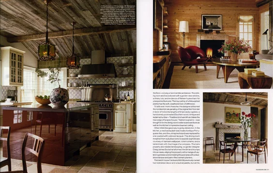
To add even more character, the designer jettisoned the nondescript oak paneling of the original first-floor den in favor of horizontal lengths of limed pecky cypress, a handsomely pockmarked Southern wood. Antique and reclaimed lumber "It adds a lot of warmth and takes the new edge off a spec house," Nahem explains was brought in for the dining room's wide-board oak floors as well as the kitchen's impressive beamed ceiling.
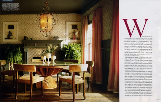
Other infelicities gave way to gutsy details too. In the kitchen, a new backsplash was made of antique Portuguese tiles, and the uninspired island was replaced by one coated with oxblood lacquer. The dining room morphed from suburban bore to seaside sophisticate courtesy of damask wallpaper, coral curtains, and a table inlaid with the image of a compass. The bare property also needed landscaping, so garden designer Craig Socia transformed the dirt and stumps into an oasis, edging the property with a hedge of Leyland cypresses and ennobling the pool area with a blue-stone terrace and palm-filled cement planters.
The beach house Caiola and McGill previously owned had restrained decor and a neutral palette, but at this point the men were ready to take more chances. Nahem was also in the mood to push his aesthetic boundaries. He surprised himself by selecting a wallpaper from the vintage-wall-covering repository Hannah's Treasures that depict historic American buildings, among them Monticello, for the powder room. "It's the kind of pattern that ten years ago I would have said, 'That's got to go,'" the designer says with a laugh. "But I think it works in a small area. It's a little folly, a joke."
Caiola and McGill appreciated the playfulness, though not all decorating suggestions were instantly accepted. One day Nahem discovered a graphic 1860s French rag rug in the precise dimensions required for the living room. The palette was wonderful too, says the designer, "like a painting." The clients weren't entirely convinced, but fearing a competitor would snap it up, Nahem made an offer if they didn't like the rug, he would buy it. "Now," McGill says, "I absolutely love it."
The most winsome investment is arguably the whimsical wallpaper covering the bedroom of the couple's eldest child, Maria, now almost two and a half. (She has twin baby brothers, William and Adam.) The comical cavorting giraffes and monkeys are not only adorable, "they keep Maria distracted while she is on the changing table," Caiola notes. It's just one of the delightful distractions that have turned spec into spectacular.


