Elle Decor, June 2022
Read The Story
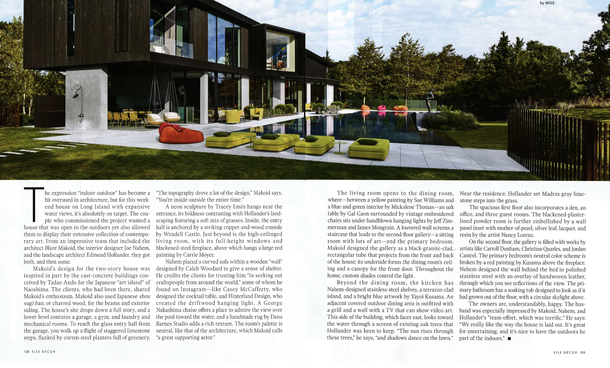
The expression “indoor-outdoor” has become a bit overused in architecture, but for this weekend house on Long Island with expansive water views, it’s absolutely on target. The couple who commissioned the project wanted a house that was open to the outdoors yet also allowed them to display their extensive collection of contemporary art. From an impressive team that included the architect Blaze Makoid, the interior designer Joe Nahem, and the landscape architect Edmund Hollander, they got both, and then some.
Makoid’s design for the two-story house was inspired in part by the cast-concrete buildings conceived by Tadao Ando for the Japanese “art island” of Naoshima. The clients, who had been there, shared Makoid’s enthusiasm. Makoid also used Japanese shou sugi ban, or charred wood, for the beams and exterior siding. The house’s site drops down a full story, and a lower level contains a garage, a gym, and laundry and mechanical rooms. To reach the glass entry hall from the garage, you walk up a flight of staggered limestone steps, flanked by corten-steel planters full of greenery. “The topography drove a lot of the design,” Makoid says. “You’re inside-outside the entire time.”
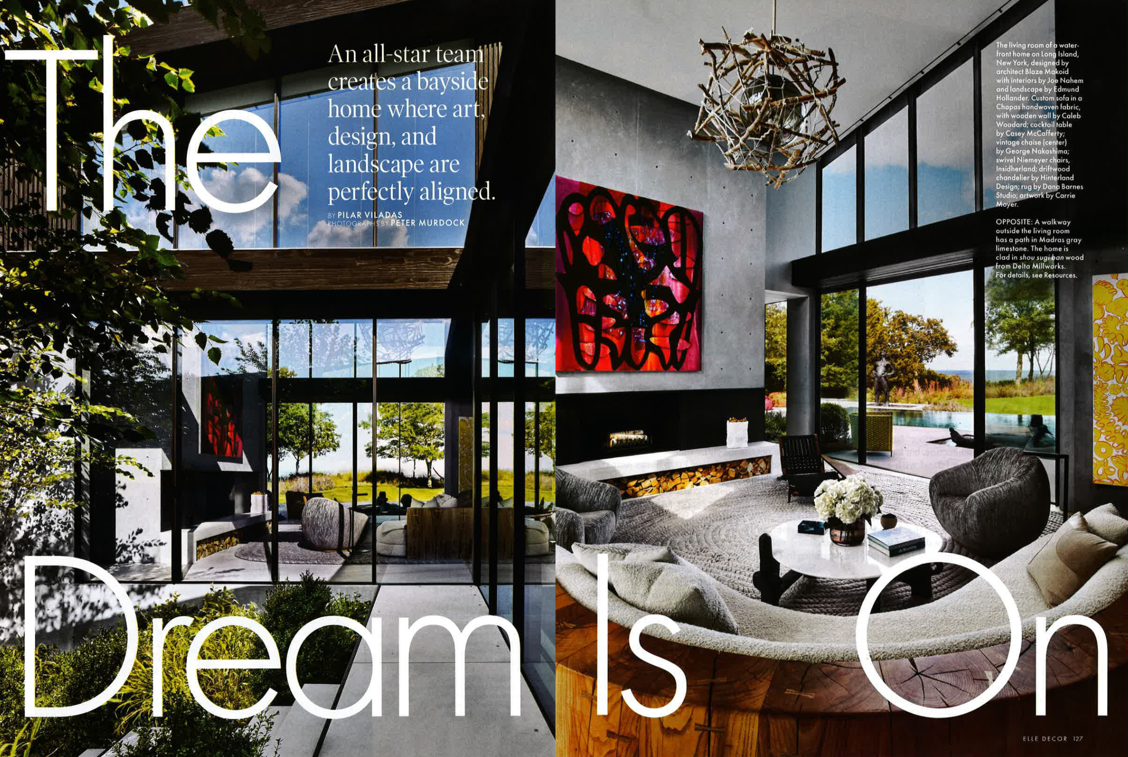
A neon sculpture by Tracey Emin hangs near the entrance, its boldness contrasting with Hollander’s landscaping featuring a soft mix of grasses. Inside, the entry hall is anchored by a striking copper-and-wood console by Wendell Castle. Just beyond is the high-ceilinged living room, with its full-height windows and blackened-steel fireplace, above which hangs a large red painting by Carrie Moyer.
Nahem placed a curved sofa within a wooden “wall” designed by Caleb Woodard to give a sense of shelter. He credits the clients for trusting him “in seeking out craftspeople from around the world,” some of whom he found on Instagram—like Casey McCafferty, who designed the cocktail table, and Hinterland Design, who created the driftwood hanging light. A George Nakashima chaise offers a place to admire the view over the pool toward the water, and a handmade rug by Dana Barnes Studio adds a rich texture. The room’s palette is neutral, like that of the architecture, which Makoid calls “a great supporting actor.”
The living room opens to the dining room, where—between a yellow painting by Sue Williams and a blue-and-green interior by Mickalene Thomas—an oak table by Gal Gaon surrounded by vintage embroidered chairs sits under handblown hanging lights by Jeff Zimmerman and James Mongrain. A louvered wall screens a staircase that leads to the second-floor gallery—a sitting room with lots of art—and the primary bedroom. Makoid designed the gallery as a black-granite-clad, rectangular tube that projects from the front and back of the house; its underside forms the dining room’s ceiling and a canopy for the front door. Throughout the home, custom shades control the light.
“The topography drove a lot of the design. You’re inside-outside the entire time.”
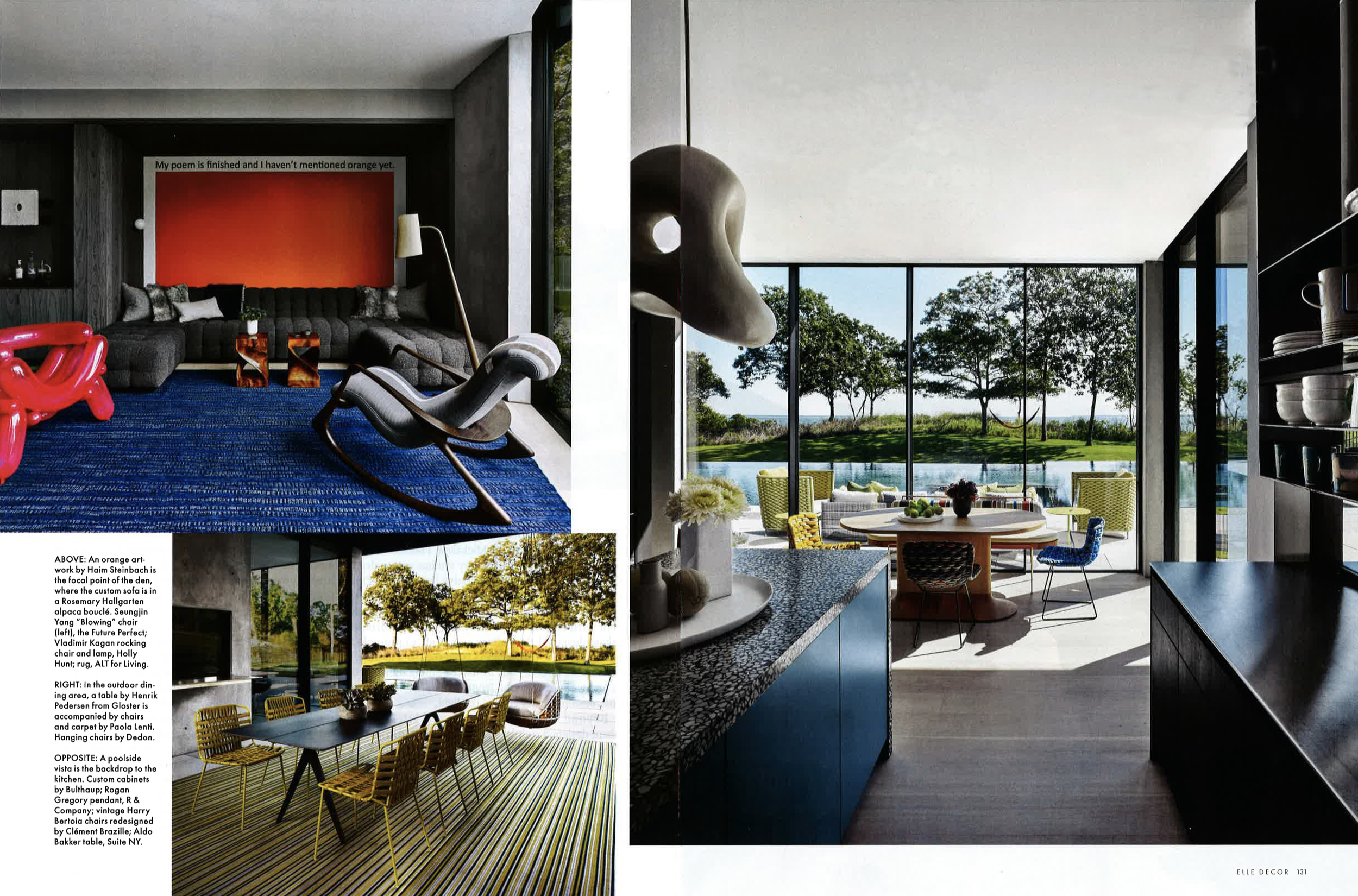
Beyond the dining room, the kitchen has Nahem-designed stainless-steel shelves, a terrazzo-clad island, and a bright blue artwork by Yayoi Kusama. An adjacent covered outdoor dining area is outfitted with a grill and a wall with a TV that can show video art. This side of the building, which faces east, looks toward the water through a screen of existing oak trees that Hollander was keen to keep. “The sun rises through these trees,” he says, “and shadows dance on the lawn.” Near the residence, Hollander set Madras gray limestone steps into the grass.
The spacious first floor also incorporates a den, an office, and three guest rooms. The blackened-plaster-lined powder room is further embellished by a wall panel inset with mother-of-pearl, silver leaf, lacquer, and resin by the artist Nancy Lorenz.
On the second floor, the gallery is filled with works by artists like Carroll Dunham, Christina Quarles, and Jordan Casteel. The primary bedroom’s neutral color scheme is broken by a red painting by Kusama above the fireplace. Nahem designed the wall behind the bed in polished stainless steel with an overlay of handwoven leather, through which you see reflections of the view. The primary bathroom has a soaking tub designed to look as if it had grown out of the floor, with a circular skylight above.
The owners are, understandably, happy. The husband was especially impressed by Makoid, Nahem, and Hollander’s “team effort, which was terrific.” He says: “We really like the way the house is laid out. It’s great for entertaining, and it’s nice to have the outdoors be part of the indoors.”


