Click here to view more pictures
Architectural Digest June '16,
"Artful Approach", written by Vicky Lowry, Photography by Pieter Estersohn,
pages 164-173
Most people test-drive a car before buying one. Why not a weekend house? Helena and Per Skarstedt, a Swedish couple who reside in Manhattan did just that.
At first, Helena recalls, they didn’t get the Hamptons, preferring instead to spend summers in Europe. But after they had children – two boys, now in their teens – they thought they’d give the East End of Long Island a spin, renting homes during the quiet off-season. One rental, a 1960s modernist house in Sagaponack, especially appealed to the family. In 2009, when it came on the market, they snapped it up. “We felt so at home and knew the property so well, where the light falls, where you end up liking to do things,” Helena says. “It already felt like our place.”
It just needed some updating, they thought, and they started looking for an architect. In Annabelle Selldorf, they found the ideal candidate to shape a beach house that would not only reflect their style—refined and understated yet inviting—but also allow them to showcase the stellar contemporary artworks Per has acquired as a dealer with galleries in Manhattan and London. After all, Selldorf creates sublime exhibition spaces—from the classically elegant Neue Galerie to David Zwirner’s austere concrete temple—as well as seaside homes that exude a poised simplicity. “We knew we wanted wall space, but we didn’t want it to feel cold or corporate,” Helena says. “We wanted it to feel like a home where things were not so precious and where kids could run around.”
The trio initially considered simply adding and extension to the original house. It had served the Skarstedts well but just needed to be bigger, with more of an indoor-outdoor layout so they could truly savor summer. Yet as the team talked it through, it became clear that new construction was in order. “The house really didn’t work,” Selldorf says. “It felt dark and unfriendly.”
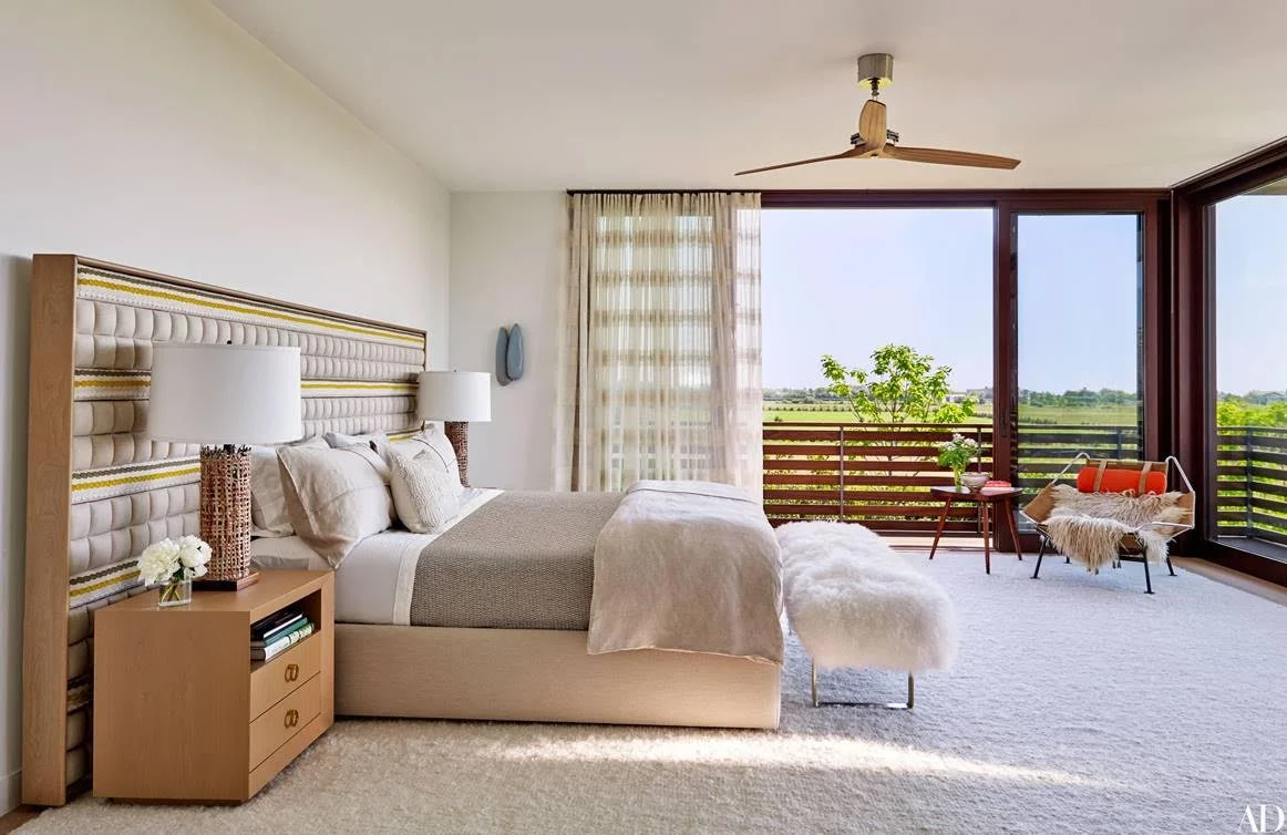
To take its place, she conceived a handsome mahogany-clad residence featuring 80 feet of sliding glass doors on one side to let in light and ocean breezes. Running along that length is a terrace shaded by a distinctive awning of painted steel and fabric. The property’s serene original courtyard, which everyone had loved, inspired the gardenlike new entryway. A rooftop deck surveys acres of preserved land, for which Sagaponack is famous, and the midnight-blue ocean beyond.
As construction was humming along, in winter 2013, the Skarstedt’s started to feel overwhelmed by the task of getting the place ready to move into that summer. The design-obsessed couple had always handled their own interior decoration, but this was their first from-scratch house, and, as Helena recalls, “we hadn’t even ordered beds.” Moreover, they desired something different from their Manhattan apartment, with its muted 1950s Scandi vibe. “You get stuck in your own thinking,” she says. “And we wanted to mix it up, make it more interesting.”
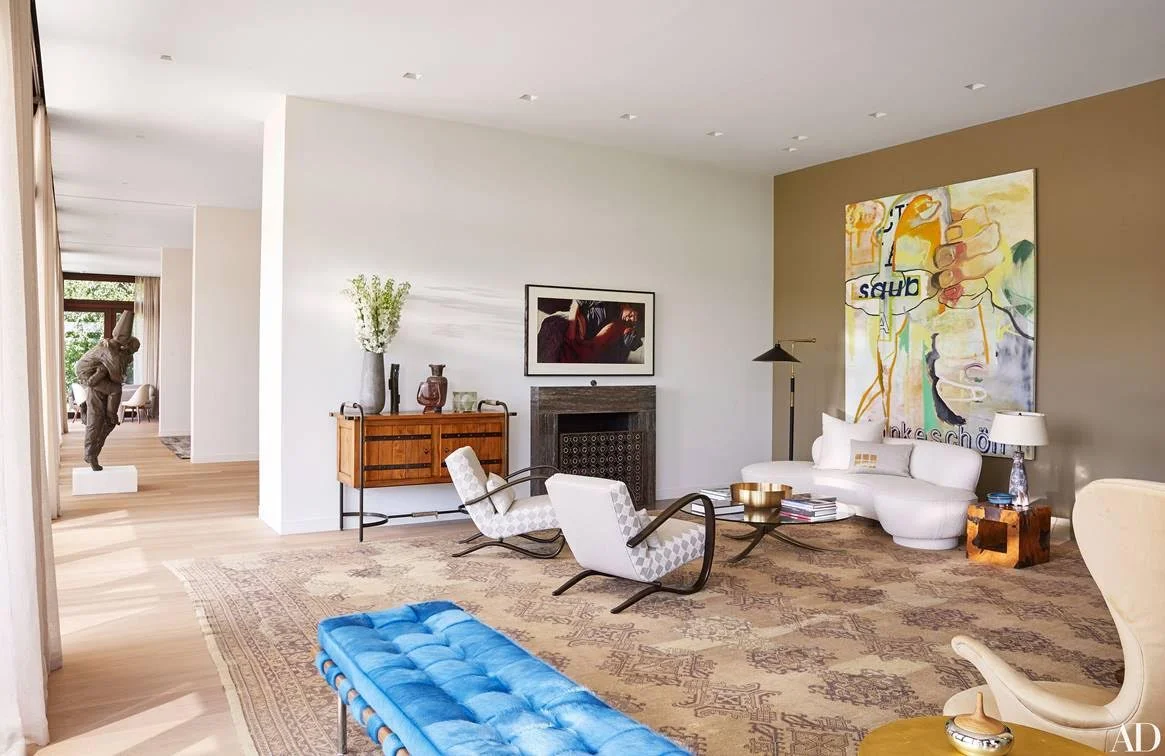
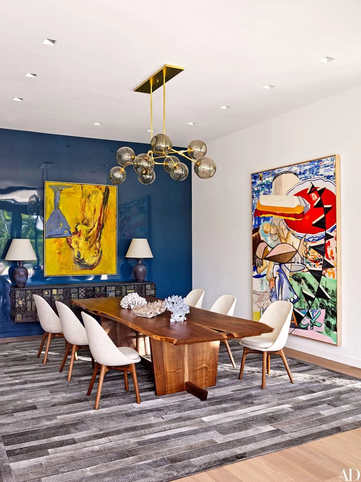
More interesting came in the form of Joe Nahem, of Fox-Nahem Associates, who has made a career of introducing bold, compelling gestures that stand up to strong contemporary architecture. His challenge: to warm up and enliven the white sheetrock interiors without distracting from powerhouse works by such artists as Albert Oehlen and Cindy Sherman. “My motto,” says Nahem, “is ‘A house does not need to look as if a decorator was there.’”
But he was working with extremely savvy clients who not only intended to use their own collection of midcentury gems (including chairs by Hans Wegner and a rare sculpted-steel console by Paul Evans, among other pieces) but also wanted to be involved in every decision, so each component underwent group analysis. The curtains, for example, “were a big conversation,” Nahem now says with a laugh. Pockets had been created in the ceiling to accommodate solar shades, but the designer thought the treatment would feel too gallery-like. Instead he chose sheer linen panels that seem to float down from above: “I knew they would help soften the space, particularly at night.” An antique Oushak rug raised eyebrows until it was brought into the living room for an audition. It happened to fit the room’s dimensions to a T, and the subdued pattern didn’t fight with the art.
Nahem went full throttle with other furnishings, however, such as the nearly 100-ppound vintage light fixture covered in the glittering Murano-glass rosettes that hangs in the three-story stairwell. “[The owners] weren’t completely sure,” he remembers, so he went ahead and had it installed. “I knew that if they saw it in place, it would stay.” The vibrant blue hide on a classic Mies van der Rohe bench was another departure for the couple. “It’s not whimsical, because we are not whimsical people,” Helena says, “but it’s not so expected.”
Now, come summer, the glass doors slide open and everyone practically lives outdoors. The pool just steps from the home, is especially convenient for Rocco, the family’s Italian water dog, who regularly swims laps and then naps in the sun. And most meals are taken on the terrace, under the filtered shade of Selldorf’s elongated awning. “Normally, after you build a house, you notice all the things you did wrong,” Per says. “But since we moved in, there is nothing we would change.


