Architectural Digest June '13, "Seismic Shift"
pages 162-169
Designer Joe Nahem radically reimages the traditional interior of a Connecticut home as a cutting-edge setting for contemporary art.
As newlyweds in the late 1990s, Allison and Warren Kanders cultivated a buttoned-down aesthetic, and they hired acclaimed designer Mica Ertegun to decorate their sprawling Colonial Revival house in Greenwich, Connecticut, in a traditional vein (AD, October 2001). Inspired by the home’s stately proportions, Ertegun fashioned patrician interiors with an assortment of Empire, Georgian, Regency, and Louis XVI antiques and select Art Deco pieces. “When we began with Mica, we didn’t have children,” Allison says. “As you evolve, your tastes evolve, and you become more sure of what you like.”
The couple discovered that what they like – indeed, love – is bold, provocative contemporary art. Warren’s success as an entrepreneur and private investor made it possible for them to fulfill their new passion. In addition to becoming major supporters of New York’s Whitney Museum of American Art, where Warren is on the board of trustees, the pair amassed a stunning group of works by such artists as John Baldessari, Jeff Koons, Gerhard Richter, and Cindy Sherman. However, the collection seemed out of sync with its surroundings. “While the house was beautiful, it was too traditional for the art to shine,” Allison says. “I decided I wanted the walls to be all white and to get rid of as much molding as possible. I wanted a younger vibe.”
They called Joe Nahem of Manhattan’s Fox-Nahem Associates, a design firm with a reputation for being sensitive to the needs of collectors. “We’ve become known for creating livable spaces around contemporary art,” he says. Nahem, who worked in close collaboration with his project manager, David Gorman, urged the Kanders to use some color on the walls, instead of just white. “You don’t want the interiors to conflict with the art, but you don’t want to make them too neutral or boring either,” he explains. Since the homeowners wanted the flexibility to rotate their art, he could not design rooms around specific pieces – except for enclosing a screened porch (now the game room) to accommodate a giant Damian Hirst butterfly painting.
Though Nahem removed the chair rails that made it awkward to hang wall-size works, he maintained the classical bones of the two-story house, ensuring the transition from the traditional exterior to the lively, modern new interior wouldn’t be disconcerting. More important, he gave every space a raison d’etre. “We hadn’t been using a lot of the areas on the first floor,” Allison says. “I told Joe I wanted each to have a purpose.”
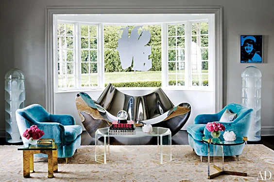
Radiating off a hallway dominated by one of Hirst’s mirrored pill cabinets, a trio of rooms that are part of the first- floor common space now have distinct identities. The cozy bar, which features a large Cindy Sherman photograph and a shiny aluminum-panel work by Rudolf Stingel displayed against gray faux-suede walls, leads into the party- oriented living room, where canvases by Koons, Richter, and Andy Warhol are offset by the dusky gray background. The room has two seating groups, one centered around a gleaming metal settee by Ron Arad and the other anchored by a custom-made kidney-shaped sofa with a swirling hand-forged bronze base. Counter-intuitively, Nahem also introduced some antique items – 18th century Swedish consoles and a massive 19th century Amritsar rug – that initially shocked the Kanders. “They said, ‘We just got rid of all that old furniture,’” Nahem recalls with a laugh. “But I always like to add unexpected elements.” The paneled library was lightened up, both literally and figuratively, with a new cerused finish for the boiserie and comfortable furniture for relaxing. “It’s now where we watch TV as a family,” Allison says.
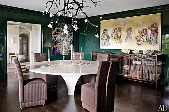
Nahem encouraged his clients to be as daring in their choice of furnishings as they are in their art preferences. For the dining room he persuaded them to commission David Wiseman, the red-hot Los Angeles sculptor, to construct a one-of-a-kind hanging lamp with lights in the form of white porcelain blossoms sprouting from bronze branches. “Joe made us take risks, and he was right,” Allison says of the fixture, which seems to grow out of the ceiling. With the room’s dark-green-lacquered walls, “it’s like being in a luscious, magical forest,” she says. Nahem adds, “That piece is as much a work of art as anything on the walls,” referring to paintings by Richard Prince, Ed Ruscha, and Mark Grotjahn as well as a striking Mike Kelley composition consisting of a mass of gold-tinged beads and jewelry affixed to a panel.
Upstairs, Nahem gutted the master suite, eliminating the sitting room to give the couple more closet space and his-and-her spa baths. In the main area, a large abstract Willem de Kooning painting overlooks a sculptural Corian bed. The white-glass-sheathed baths, meanwhile, feature custom-made resin-and-metal friezes with coordinating cabinet and counter accents by the London art studio Based Upon. And for Allison’s dressing room, Nahem consulted a stylist to discern the best way to store her clothing and accessories. “We even measured the height of her shoes,” he says. The room’s focal point is an elliptical dresser finished in silver-metallic lacquer, with glass display shelves suspended above.
Nahem’s general policy is to keep clients out of their houses until renovations are complete. (“I know when they see everything together, they’ll get it,” he explains.) But for this project, the clients were directly involved in the installation of the art, so to avoid any out-of-context shocks, he left the furniture covered. His plan worked, and the home’s reveal, eight months in the making, was a thrilling Through the Looking-Glass experience. “Even though we had lived there for ten years, it was like a whole new house,” Allison says. “It had been reinvented in a way that’s exactly right for how we want to live now.”


